
Rajasthan Tourism
Endowed with natural beauty, a great history, royal heritage and a rich culture, Rajasthan has a flourishing tourism industry for both domestic and international tourists. Tourism accounts for eight percent of the state's domestic product.
The government asked us to redesign the state’s tourism logo as the existing logo fails to represent the richness of the state.
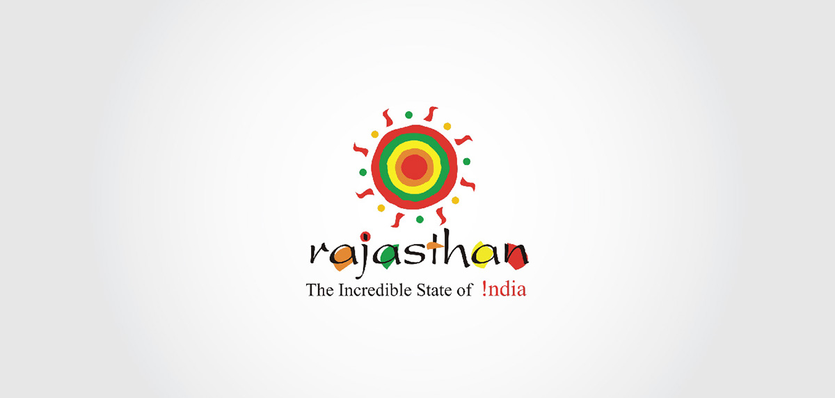
Old / Existing Logo

Mood Board
Rebranding | option - 1
The logo shocases the spirit of rajasthan as it encompasses all the key elements of the state - be it the fauna, flora, rich heritage etc. The fluidity of the design suggests the well binded attributes of the state.

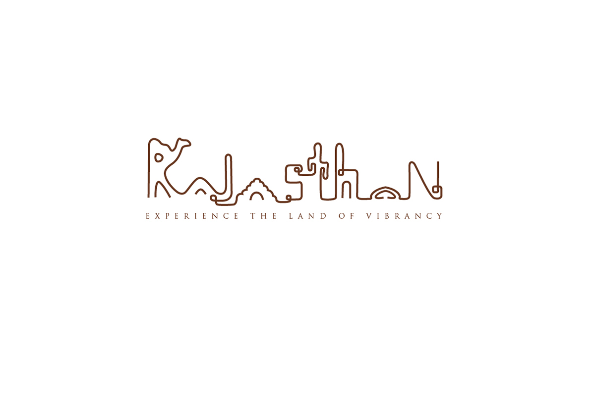
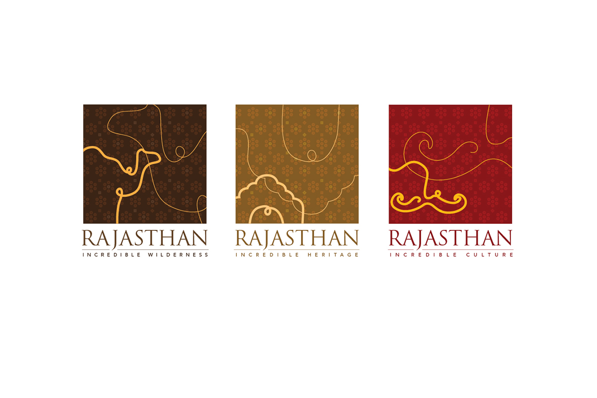
Rebranding | option - 2
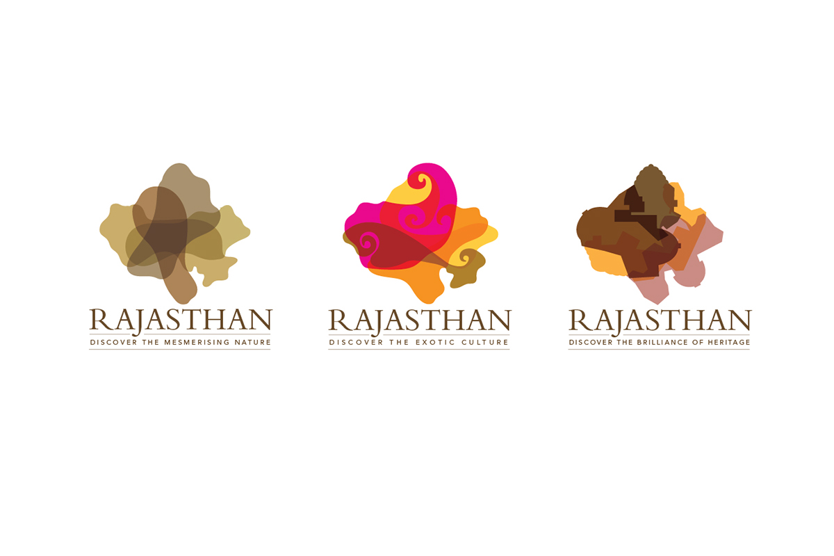
An abstract representation of the beautiful state - Rajasthan. The form of the map styled in different hues and elements suggesting Rajasthan is intended to showcase the versatile branding while keeping the form of the map consistent. The first one highlights the landscape, second highlights the culture and the third highlights the heritage. The branding is versatile in terms of it's flexibility in accomodating any attribute of the state while keeping the form of the map consistent.
Rebranding | option - 3
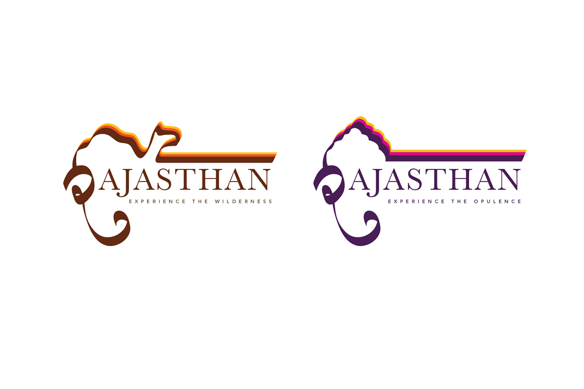
Another versatile and extendable branding whereby the iconography placed on the top of the word, 'Rajasthan' is subjected to change based on the different attribute of the state intented to be communicated. For eg. wilderness is well reflected with an iconography of a camel and so is it's royal heritage with the representation of an arch. Similarly other attributes can be represented through various other iconographies.
The first letter 'R' of Rajasthan is intented to showcase the devnagri script (hindi) indigenous to the state. Also the form is derived from the typical characteristic - moustache of Rajasthani men to add the flavour of the region.
Rebranding | option - 4
Another versatile and extendable branding whereby each seal communicates a different attribute of the state. Fluid lines running in the foreground are making different forms suggesting the different cityscape of the land - animals, architecture, culture and so on... Also the impression of the pattern in the background is derived from the indigeneous folk art used in their textiles. Any folk art is a root of that particular region, hence the logo has a rich flavour of the land.
Another versatile and extendable branding whereby each seal communicates a different attribute of the state. Fluid lines running in the foreground are making different forms suggesting the different cityscape of the land - animals, architecture, culture and so on... Also the impression of the pattern in the background is derived from the indigeneous folk art used in their textiles. Any folk art is a root of that particular region, hence the logo has a rich flavour of the land.

Rebranding | option - 5
The logo is based on the concept of NAVRATNA ( the nine heritage segments of Rajasthan )
These nine segments depicted in each of the nine boxes are: architecture, legends, gems and jewels, nature and minerals, art forms, weaves and crafts, fairs and festivals, flavours in feast, antiquities. The concept of NAVRATNA clearly comprises the entire gist of the state and the presence of ashok insignia together makes it a perfect state logo.
The logo when scaled to a small size appears to be patches of different colours which exudes the colorful spirit of the state. The logo when blown up to a bigger size unfolds the story of 'Navratna'.


Rebranding | option - 6
This particular option was precisely created on the client's (government of Rajasthan) demand.
This particular option was precisely created on the client's (government of Rajasthan) demand.
A simple crest made out of the camels' joining of legs bearing the map of the state and upholding the icon of ashok insignia,
was loved by the client.
After a rigorous to and fro of mails for good six months, the government changed and the logo was unfortunately not used.


